0

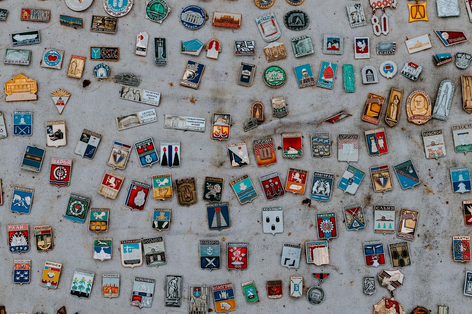
Key Takeaways
- Contrast Carries Distance: High-contrast color pairings keep the design readable from across a room.
- Texture Changes Light: Embroidered, woven, and PVC finishes each catch light differently and change how the patch feels in hand.
- Shape Serves Art: Pick an outline that supports the artwork rather than crowding it, and keep the edges clean.
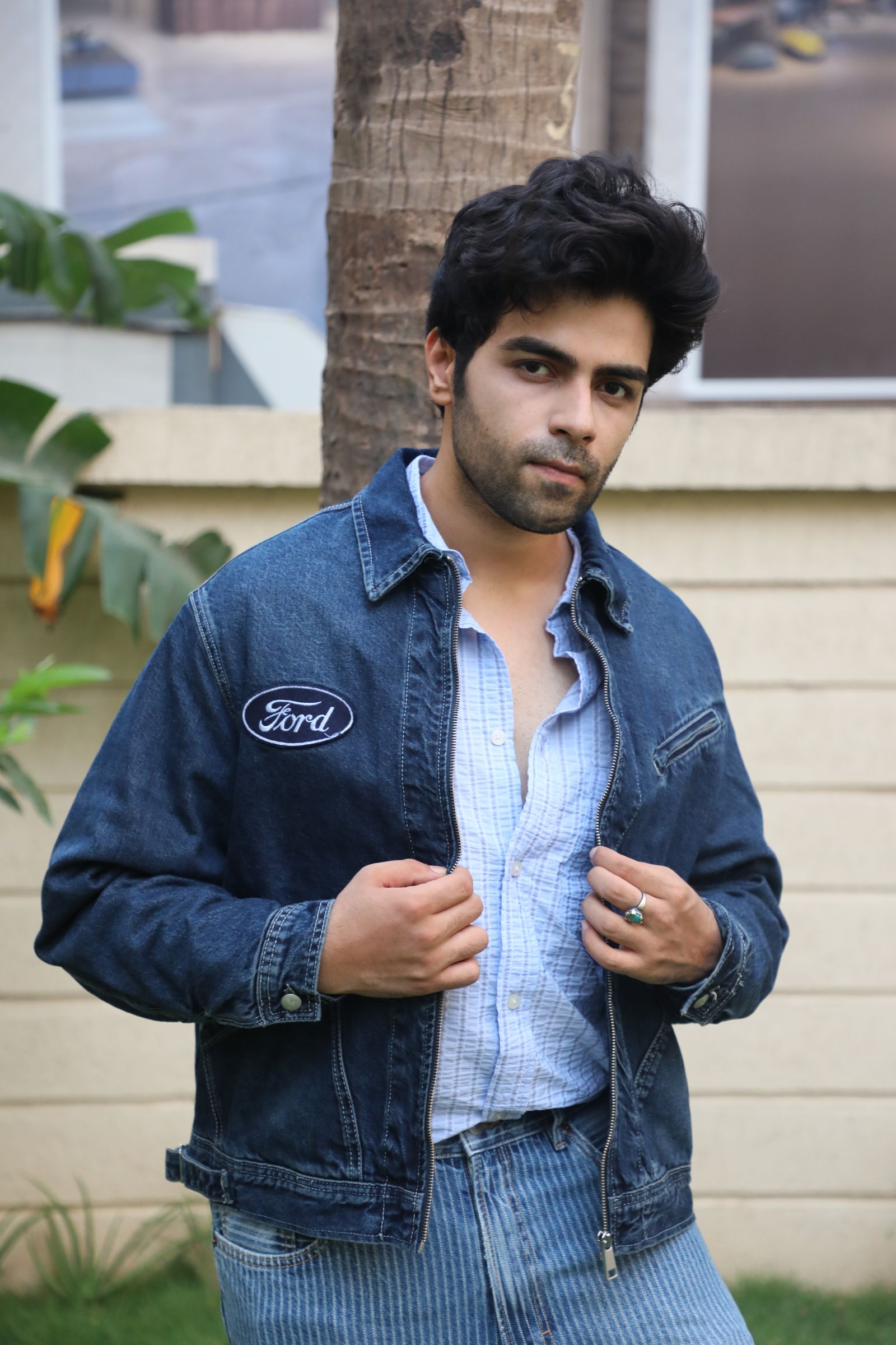
A patch earns attention when it looks clear, intentional, and built for its purpose. At Custom Pins Now, we see designs succeed when you choose colors that contrast, textures that add depth, and shapes that fit the message and placement. Want a patch that stands out on a jacket, hat, or bag?
You design a patch that pops by pairing high-contrast colors with the right material texture and a shape that supports the artwork instead of crowding it. Smart color choices guide the eye, while embroidered, woven, or PVC textures change how light hits the design and how it feels in hand. Shape matters just as much because clean edges and balanced proportions keep details readable at a distance.
We’ll walk through how to select standout colors, use texture for visual impact, and design shapes that feel custom instead of generic. If you want a fast way to turn these ideas into a finished product, our free quote process makes it easy to move from concept to production.
Choosing Standout Colors
Strong color choices determine whether a patch reads clearly at a distance or fades into the background. We focus on color theory, contrast, and current palette trends to help your design look intentional and production-ready.
Color Theory Principles
Color theory gives structure to creative choices. We recommend starting with a limited palette of 2–4 colors to keep the design clean and easy to reproduce.
Different hues trigger different reactions, which matters for promotional patches tied to a brand or event. Use this quick reference when planning your design:
- Red — Common Association: Energy, urgency — Best Use Case: Events, action brands
- Blue — Common Association: Trust, stability — Best Use Case: Corporate or nonprofit
- Green — Common Association: Growth, balance — Best Use Case: Outdoor or wellness
- Black — Common Association: Authority, contrast — Best Use Case: Text, outlines
Warm colors advance visually, while cool colors recede. Use that behavior to control what viewers notice first. If you already have brand colors, we can help adjust shades so they stitch cleanly and stay accurate.
Contrast and Visibility
High contrast makes a patch readable from several feet away. This matters for uniforms, bags, and jackets where people see the patch in motion.
Pair light elements with dark backgrounds, or use complementary colors from opposite sides of the color wheel. Examples include blue with orange or red with green.
Neutral colors play a key role. Black, white, and gray ground the design and help brighter colors stand out without overwhelming the layout.
For text-heavy patches, we suggest:
- Dark borders around light lettering
- Solid background fills instead of gradients
- Minimal color overlap in small areas
We review contrast during production planning so your patch stays sharp after stitching, printing, or weaving.
Trendy Palette Selection
Trends influence perception, especially for promotional products meant to feel current. Right now, we see strong demand for muted earth tones, monochrome palettes, and soft pastels paired with bold accents.
That said, trends work best when they support your brand instead of replacing it. A limited trendy accent color often performs better than a full trend-based palette.
Ask yourself:
- Will this palette still look good next year?
- Does it align with where customers see your brand?
- Can it reproduce consistently across patch types?
If you want help narrowing options, our team at Custom Pins Now can review palette ideas and provide a fast quote based on your final color direction.
Texture Techniques for Visual Impact
Texture controls how a patch looks, feels, and holds up in real use. The right techniques create depth, guide attention, and reinforce brand quality without increasing complexity or cost.
Fabric Choices
Fabric sets the foundation for texture and durability. Twill remains the most common backing because it supports clean stitching and resists fraying under daily wear.
Felt offers a softer hand and works well for vintage or casual designs. It compresses easily, which limits fine detail but adds visual warmth.
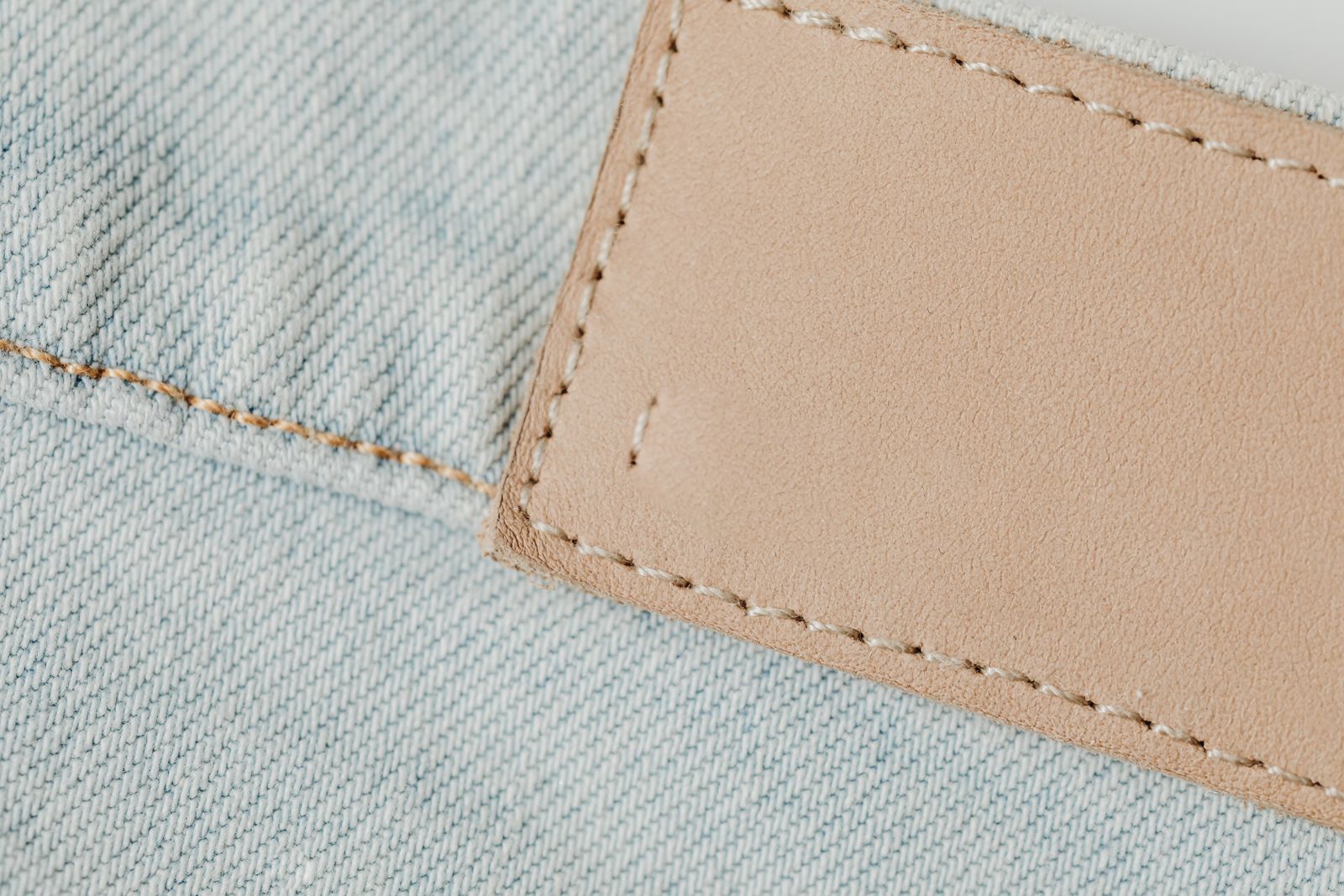
Leather and faux leather create a premium look with natural grain. These materials suit minimalist designs with bold shapes and limited colors.
Common fabric options at a glance:
- Twill — Best For: Logos, uniforms, fine detail — Key Trade‑Off: Firmer feel
- Felt — Best For: Retro styles, simple shapes — Key Trade‑Off: Lower detail
- Leather — Best For: Premium branding — Key Trade‑Off: Limited color range
Not sure which fabric fits your use case? We help clients match fabric to wear conditions before they request a free quote.
Embroidered Versus Woven Textures
Embroidery uses raised threads to build texture you can see and feel. It works best for bold logos, thick lines, and designs viewed from a distance.
Woven patches use thinner threads stitched flat. This approach captures small text, gradients, and sharp edges with less surface height.
Choose based on detail level, not trend. If legibility matters at close range, woven often performs better.
Quick decision guide:
- Embroidered: thicker lines, rugged look, tactile feel
- Woven: fine text, smooth surface, higher detail density
We often combine both approaches in one order to test what resonates before scaling production.
Adding Dimensional Effects
Dimensional techniques increase visual hierarchy without changing the core design. The most common option is 3D puff embroidery, which raises select areas using foam beneath the thread.
Layered stitching creates depth by stacking thread heights. Designers often apply this to borders or key symbols to guide the eye.
Printed texture overlays simulate grain or fabric effects while keeping the surface flat. This works well for photographic or full‑color patches.
High‑impact dimensional options:
- 3D puff for logos or lettering
- Layered stitch heights for emphasis
- Textured prints for color‑heavy designs
We review placement and wear conditions to ensure added dimension stays durable. If you want texture that supports your brand and budget, our team can walk you through options when you request a free quote.
Designing Unique Patch Shapes
Shape controls how a patch reads at a distance and how it sits on real products like hats, jackets, and bags. The right outline improves legibility, supports stitching limits, and reinforces brand recognition without adding production cost.
Traditional Versus Custom Shapes
Traditional shapes-circles, shields, rectangles, and ovals-work because they stitch cleanly and fit most placements. They align well with embroidered borders and hold detail at small sizes. For bulk orders or fast turnarounds, these shapes reduce setup friction.
Custom shapes add distinction when used with purpose. A curved edge can follow a hat’s crown, while a silhouette cut to a logo removes wasted space. We advise testing how the shape behaves on the product, not just on screen.
Quick comparison
- Circle — Best Use: Logos, badges — Watch Outs: Crowding at edges
- Rectangle — Best Use: Text-heavy designs — Watch Outs: Sharp corners on hats
- Custom cut — Best Use: Brand icons — Watch Outs: Thin points, stitch limits
If you want help validating a shape, our free quote process includes production feedback.
Shape and Brand Identity
Shape should echo what your brand stands for. A rugged outdoor brand benefits from angular lines and shields, while a lifestyle label often reads better with soft curves. The outline becomes part of the logo system once customers see it repeatedly.
We recommend matching shape to message and placement. Ask simple questions: Will this shape still read from six feet away? Does it feel natural on a cap or sleeve? Those answers guide smart decisions.
Common brand-to-shape pairings include:
- Heritage or authority: shields, crests
- Modern or playful: rounded custom cuts
- Industrial or tactical: hard angles, tabs
When shape reinforces identity, patches feel intentional. That clarity helps conversions-and it starts with a clear request when you ask us for a quote at Custom Pins Now.