0

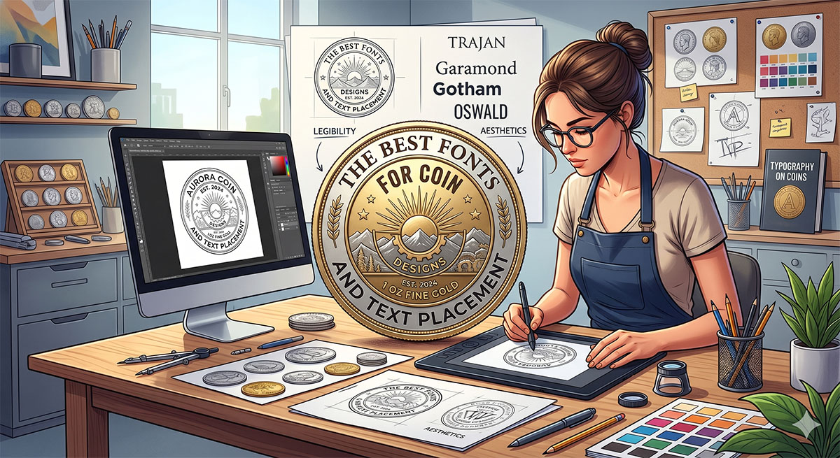
Key Takeaways
- Simplicity is Superior: Bold, simple fonts (sans-serif or sturdy serifs) survive the minting process far better than thin scripts.
- Arc Your Text: Utilizing the outer ring for text preserves the center for high-impact 3D or 2D artwork.
- Size Matters: Never go below a 5-point font; anything smaller risks becoming an unreadable metallic blur.
Great coin design makes a small surface speak clearly. You want text that stays sharp at a glance and placement that feels intentional, whether you design a commemorative coin or a promotional giveaway. We see this every day at Custom Pins Now, where small choices decide whether a coin looks premium or forgettable.
The best coin designs use bold, simple fonts at no smaller than 5-point size, limit the design to two font styles, and place text along the outer ring to protect readability and balance. When you follow these rules, your message survives metal stamping, wear, and distance without losing clarity.
We will walk you through font selection, smart text placement, and advanced details like 2D versus 3D artwork so your coin works in the real world, not just on screen. If you want a design that looks clean, professional, and quote-ready, you are in the right place.
Choosing the Best Fonts for Coin Designs
Font choice on a coin affects readability, durability, and brand perception. We focus on letterforms that strike cleanly in metal, stay legible at small sizes, and fit the story your coin needs to tell.
Font Styles for Readability
Coins demand clarity first. Small diameters, raised edges, and metallic finishes can blur weak letterforms. We recommend fonts with open counters, even stroke widths, and moderate spacing so text remains readable after minting.
Short labels, dates, and mottos work best with sturdy styles. Thin scripts and decorative fonts often lose detail during striking or enamel filling. High contrast between text and background also matters, especially on plated finishes.
Readable font traits for coins:
- Medium to bold weights.
- Simple shapes with minimal ornament.
- Consistent letter spacing (tracking).
- Clear numerals, especially 0, 1, and 8.
Serif vs. Sans-Serif Fonts
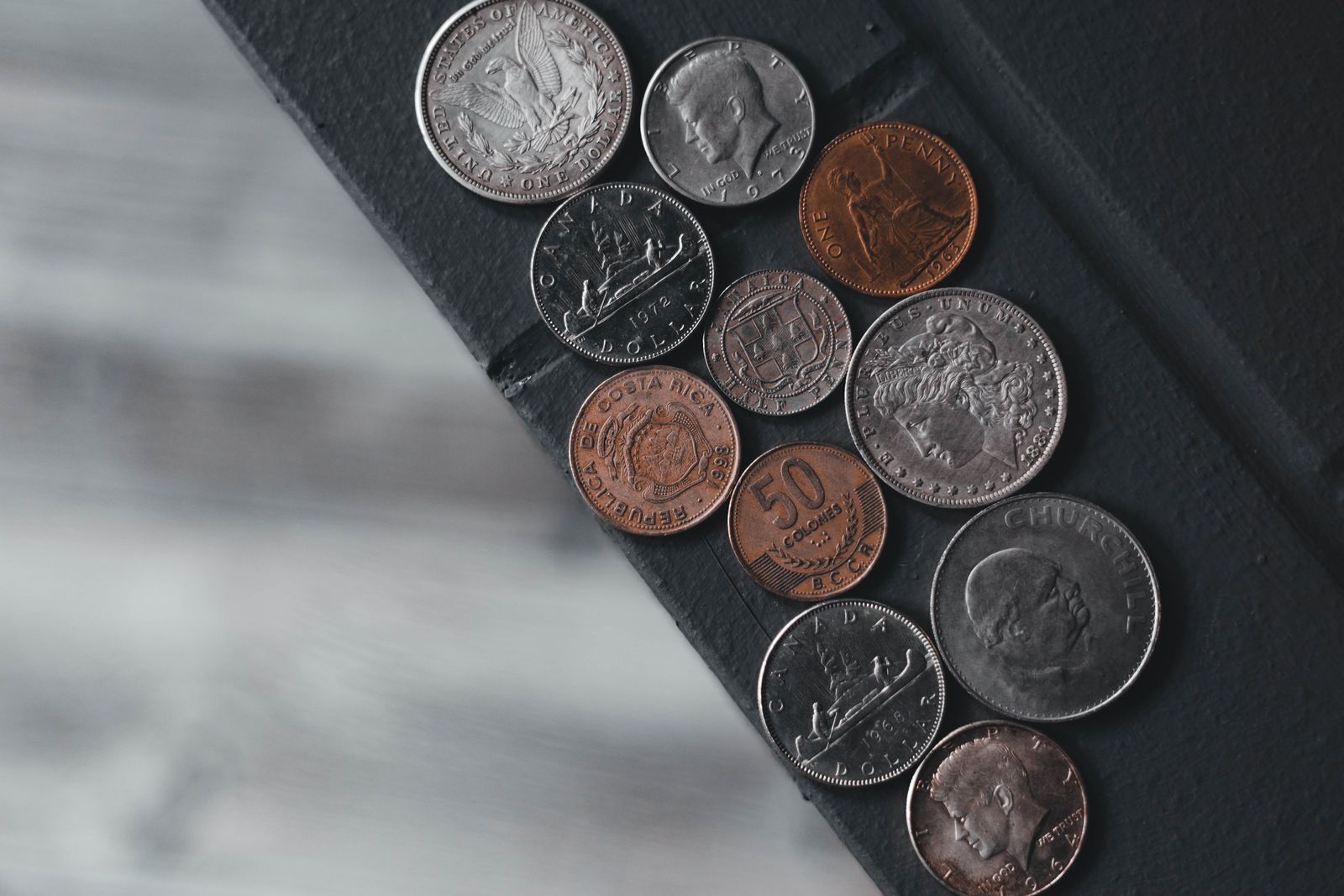
Serif fonts bring structure and tradition. Their small finishing strokes help guide the eye around circular layouts, which works well for seals, anniversaries, and official emblems. They hold up well in relief when the serifs stay short and blunt.
Sans-serif fonts feel modern and direct. They suit promotional coins, startups, and clean brand marks. Sans styles also engrave cleanly on smaller coins where extra detail would clutter the surface.
Comparison for Use Cases:
- Commemorative Coins: Serif is better for a formal tone and visual rhythm.
- Brand Promotions: Sans-serif is better for a clean look and fast recognition.
- Small Text Areas: Sans-serif is better because it has fewer fine details to blur.
Optimal Text Placement Strategies
Effective coin designs rely on precise text placement to protect clarity, balance, and brand impact. We focus on hierarchy, alignment, and layout choices that hold up at small sizes.
Balancing Visual Elements
Balanced text placement keeps a coin readable without crowding the artwork. We recommend assigning a clear role to each text element, such as a primary message, secondary detail, and date text.
Use hierarchy to guide the eye in a single pass. Larger type belongs near the visual center or along the dominant axis, while smaller text supports it without competing.
Best practices for layouts:
- Place the main message on the top arc or center field.
- Keep supporting text opposite the primary element (bottom arc).
- Match text weight to nearby visual mass to avoid a "lopsided" look.
Legibility at Small Scale
Coins demand legibility at very small sizes. Text that looks fine on a large monitor often fails after minting, especially with shallow relief or high-polish finishes that create glare.
Design checks before production:
- Minimum stroke width stays consistent across all letters.
- Letter spacing increases slightly for curved paths to prevent "touching."
- Text avoids the extreme edges where physical wear occurs first.
Circular vs. Linear Text Layouts
Circular text fits coins naturally, but it requires careful control. Poor alignment creates uneven spacing and visual tension. Linear text works best across shields, banners, or center fields.
Layout Selection:
- Circular Layout: Best for names and mottos; requires even spacing and baseline control.
- Linear Layout: Best for dates and values; provides strong contrast and horizontal alignment.
Advanced Design Considerations
Strong coin design depends on how type works with artwork and how well the message reads across audiences. Small technical choices affect clarity and perceived quality.
Integrating Typography With Coin Imagery
Type should support the imagery, not compete with it. We align text to natural shapes like borders, shields, or circular rims to preserve balance.
Short text performs best. We recommend one primary font and, at most, one secondary font to maintain hierarchy. Contrast matters more than decoration.
Practical Guidelines for Integration:
- Rim Text: Increase spacing by roughly 5% to 10% to account for the curve.
- Small Lettering: Avoid condensed fonts which can "fill in" during the plating process.
- Detailed Imagery: Use heavier font weights so the text isn't "lost" behind the art.
Accessibility and Internationalization
Coins often serve diverse audiences, so readability cannot assume one language or script. Accessibility starts with clear letterforms. Fonts with open counters and distinct numerals reduce misreading, especially on antique finishes.
For international or diverse use:
- Avoid decorative fonts that lack full Unicode or special character support.
- Test accents, umlauts, and non-Latin characters at size before final approval.
- Keep line lengths short to prevent visual compression on curved surfaces.