0


Key Takeaways
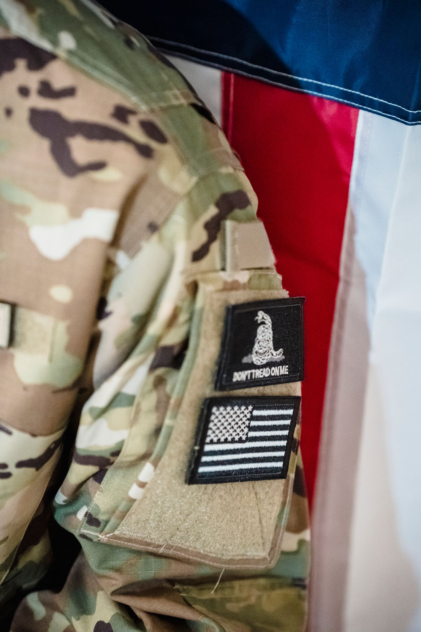
- Tactile Loyalty: Corporate challenge coins transform abstract appreciation into a tangible symbol of belonging that employees value more than disposable rewards.
- Strategic Design: High-recall coins use clean lines, high contrast, and singular imagery to ensure the brand’s message is recognized and remembered instantly.
- Cultural Anchors: Beyond recognition, coins serve as physical milestones for anniversaries, product launches, and core values, anchoring company culture in a permanent form.
- Perceived Value: Elements like weight, limited-edition numbering, and premium finishes signal prestige, encouraging employees to display and keep their awards long-term.
Coins stay memorable because they trigger emotion, recognition, and meaning through symbols, craftsmanship, and cultural cues. A coin becomes memorable when its design aligns visual clarity with shared values, making it easy to recognize and hard to forget.
We see this psychology at work when strong symbols, balanced layouts, and tactile details signal status, history, or belonging. The same forces that draw collectors to iconic national coins also shape how people respond to custom promotional designs.
We explore how the brain processes visual symbols, which design elements stick over time, and why real-world coin examples continue to resonate. That insight helps us design custom coins and pins that people keep, display, and talk about—long after the first impression.
Key Psychological Factors in Coin Design
Memorable coin design relies on how people see, feel, and judge value within seconds. When we design custom coins, we focus on visual impact, emotional meaning, and signals of worth that influence how a coin gets noticed, kept, and shared.
Visual Attraction and First Impressions
People decide whether a coin feels appealing almost instantly. Shape, contrast, and surface finish drive that first reaction before anyone studies details.
We see stronger engagement when designs use clean lines, balanced spacing, and limited color palettes. Overcrowded layouts reduce clarity and make coins harder to recognize at a glance.
Design Elements and Their Psychological Effects:
- High contrast: Improves recognition speed.
- Polished vs. matte finishes: Signals formality or prestige.
- Symmetry: Feels stable and intentional.
When we create custom coins for brands or events, we ask a simple question: Would someone want to pick this up? That instinctive pull often decides whether a coin becomes memorable or ignored.
Symbolism and Emotional Response
Symbols turn metal into meaning. Icons, dates, and imagery trigger memory, identity, and personal relevance.
National emblems often signal authority or heritage. Animals suggest strength or protection. Abstract marks can still work when they connect clearly to a mission or story. The key lies in clarity, not complexity.
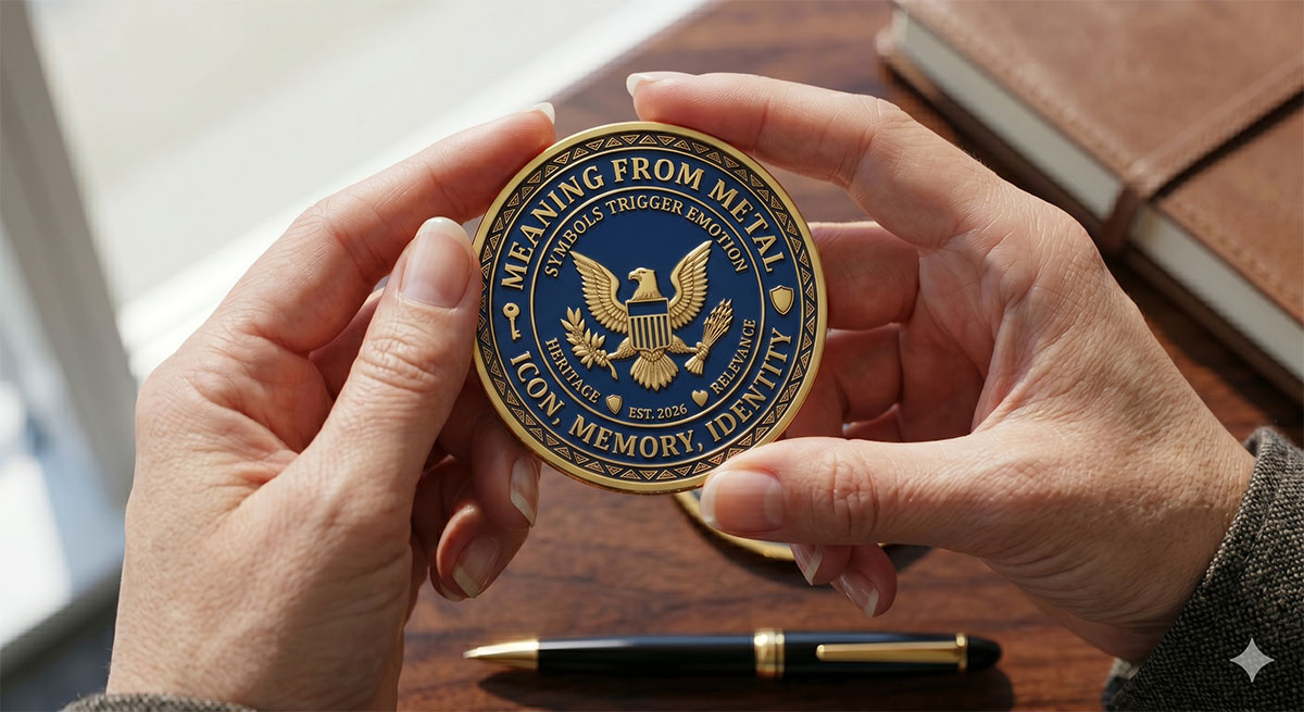
We encourage clients to choose symbols that align with what they want people to feel. Pride? Trust? Belonging? Coins that spark emotion tend to stay longer in collections and conversations.
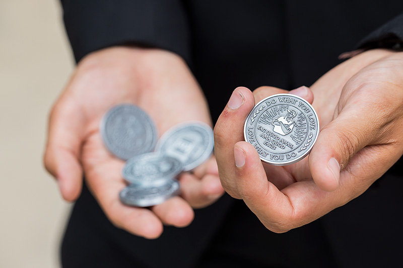
Short inscriptions also matter. A few well-chosen words outperform long text blocks because people remember phrases, not paragraphs. This approach works especially well for promotional coins tied to milestones or recognition programs.
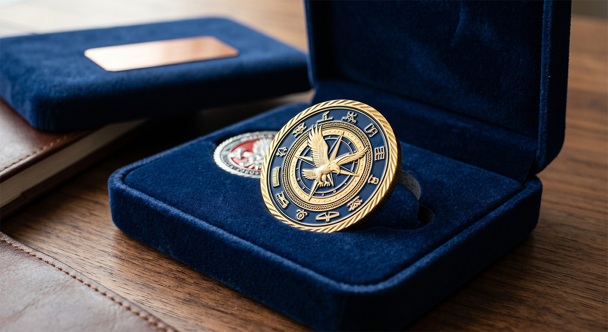
Perceived Value and Rarity
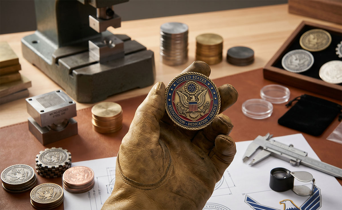
People assign value based on cues, even before they know a coin’s purpose. Weight, thickness, and finish all influence perceived worth. Limited runs increase desirability because scarcity signals importance. Numbered edges or year markings reinforce that effect without adding clutter.
We often recommend combining these features:
- Limited quantities
- Distinct edge treatments
- Premium plating options
When a coin feels rare, people treat it with care. That reaction helps brands extend their message beyond the moment of distribution. If you want a coin that people keep, display, or talk about, perceived value needs to guide every design decision.
Design Elements That Influence Memory
Certain visual choices make a coin easier to recognize, recall, and value over time. Color decisions, symbolic imagery, and precise lettering shape how people process and remember what they hold in their hands.
Color Usage and Contrast
Color guides attention before a viewer reads a single word. High-contrast palettes help key elements stand out, especially on small surfaces like coins. We often see stronger recall when designers limit colors to two or three and pair them with a consistent metal finish.
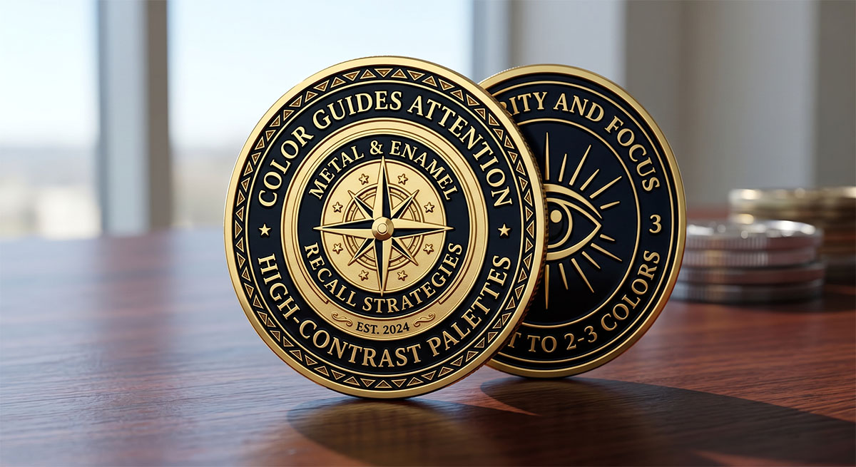
Contrast matters more than brightness. Dark enamel against polished metal, or light tones against matte fields, improves clarity and reduces visual fatigue. Coins that rely on subtle contrast often lose detail at arm’s length.
Common high-recall color strategies:
- One dominant color paired with neutral metal.
- Accent colors used only for symbols or dates.
- Consistent color placement on obverse and reverse.
Imagery and Iconography
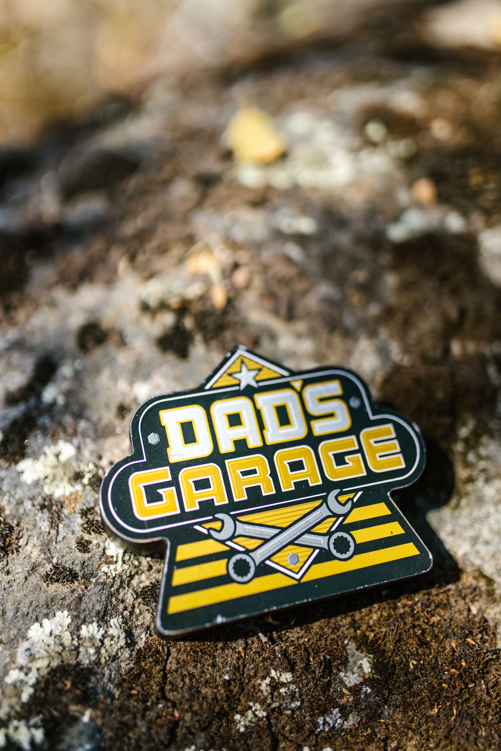
Images anchor memory faster than text. Recognizable symbols, faces, or tools give the brain something concrete to store. Coins that feature a single, clear image tend to outperform crowded designs in recall.
We see strong results when imagery connects directly to identity or achievement. Military units use insignia. Companies use logos or product silhouettes. Commemorative coins use dates paired with a defining symbol.
Scale and relief play a role. Raised elements create tactile feedback, which reinforces memory through touch. Flat, low-relief designs often feel less distinct. Effective imagery usually follows a simple rule: one message, one image.
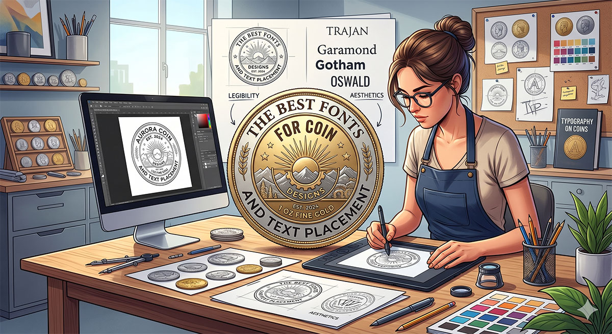
Typography and Lettering
Lettering shapes how easily a coin communicates. Clean, legible fonts improve recall because people process them faster. Decorative fonts may look appealing but often reduce clarity at small sizes.
Spacing matters as much as font choice. Tight lettering blurs when struck in metal. Generous spacing preserves detail and keeps legends readable over time.
We recommend limiting text to essentials:
- Organization or event name.
- Date or milestone.
- Short motto or unit designation.
Consistent alignment around the coin’s edge improves visual flow. Straight baselines work best for central text, while curved legends suit outer rings.
Real-World Examples of Memorable Coins
Memorable coins share clear traits: a focused purpose, recognizable imagery, and design choices that communicate value at a glance. We see these traits repeat across commemorative issues, historical circulation coins, and modern experimental designs.
Commemorative Issues
Commemorative coins succeed when they anchor emotion to a specific event or milestone. Governments often issue them to mark anniversaries, national achievements, or cultural figures, and collectors respond to that clarity of purpose.
A strong example includes modern American Silver Eagle commemoratives, which pair a consistent national symbol with limited-year releases. The design stays familiar, while dates and finishes signal rarity.
Key design traits that work:
- Clear dates and inscriptions tied to the event.
- Symbolic imagery that needs little explanation.
- Limited minting that reinforces significance.
Historical Circulation Coins
Circulation coins become memorable when they reflect authority, belief, or identity. The Roman denarius, for example, displayed a ruler’s profile and symbols to reinforce power and legitimacy. People handled that message daily.
The Athenian drachma worked the same way. Athena’s image and the owl symbolized wisdom and civic pride. These designs stayed consistent for long periods, which strengthened recognition.
Factors behind historical staying power:
- Portraits: These humanize authority and create a personal connection.
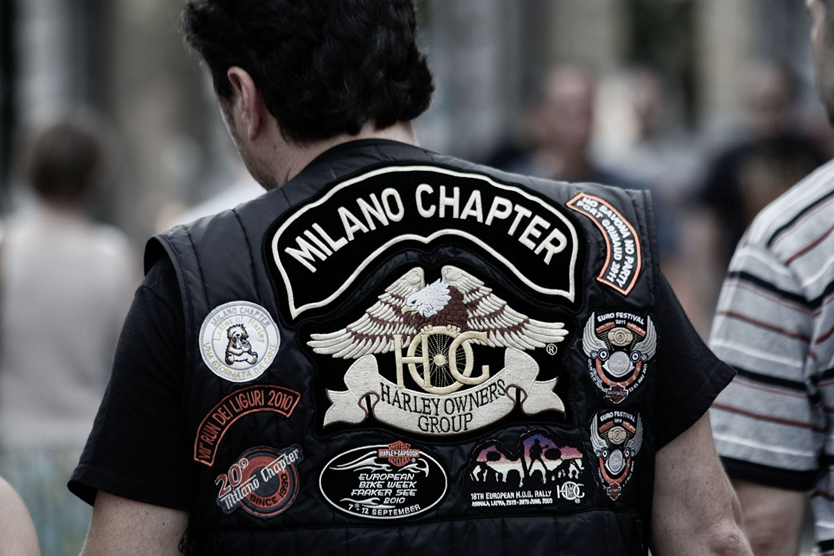
- Shared Symbols: These reinforce common values and religious or civic identity.
- Repetition: Frequent handling of consistent imagery builds instant recognition.
Modern Innovative Designs
Modern coins stand out by breaking material and visual norms. Some mints now use titanium finishes, unconventional shapes, or glow-in-the-dark elements to attract attention without losing meaning.
Collectors respond when innovation supports the story. A futuristic finish paired with national or cultural symbols feels intentional, not gimmicky. Design still leads; materials simply amplify it.
Effective modern features include:
- Mixed metals for contrast.
- Minimalist layouts for fast recognition.
- Tactile edges or textures.
We apply these same ideas to branded coins and pins. Want a design that feels current and memorable? We can help you explore options and pricing through our free quote page.